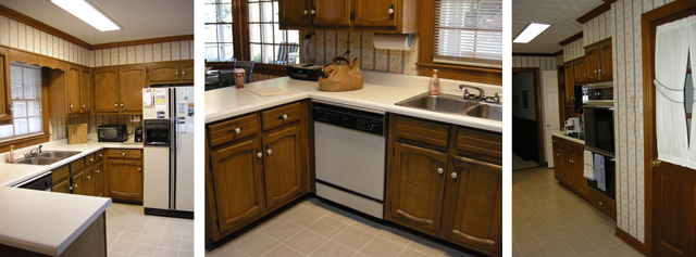
Enough with the 1980’s kitchen, it’s time for a new one! Having updated kitchens in former homes, I’m a big believer in living with your old kitchen while you design your new one. I like to get a feel for the way the kitchen functions and see how traffic flows through the space before planning a complete renovation. After living with this kitchen for a while, it was easy to see where improvements were needed and it wasn’t a short list!
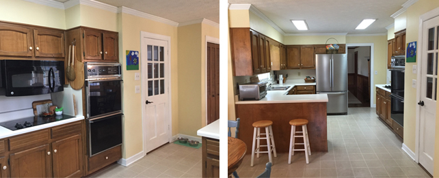
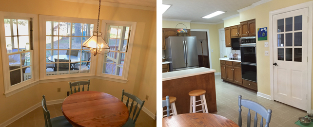
As you can see from the photos, the only immediate updates were to purchase a new refrigerator and remove wallpaper and paint the walls. The 80’s wallpaper had to go, it was a messy and frustrating process to do it, but it was an improvement… not much but an improvement!
Starting Our Design With The BIG Changes in Mind
1. Odd Work Triangle
Check out the Work Triangle, that’s the path you take in your kitchen between the cooktop, sink and refrigerator when preparing a meal. After chopping/prepping food near the sink it must then be carried across the floor to the cooktop. I found this to be awkward and messy as something frequently would end up on the floor. And, while you’re cooking, you’ll be standing in the traffic pattern leading to the pantry, garage, laundry and screen porch. It’s a very good thing to cook in a kitchen for a while before you renovate!
2. Too Many Tables
The eat-in area was nice, but we also had a table just a few feet away on our screened-in porch and the formal dining room was nearby as well. So for our new kitchen design, we opted to remove the eat-in area and add 2 counters that seat 4 each on both sides of the kitchen. By extending the kitchen into the eat-in area we got more storage as well as floor space for two people to work in the kitchen. Since we love to entertain, this design keeps people close enough for conversation but they are not getting bumped and spilled on while the food is being prepared.
3. The sink by the window rule
I’ve noticed that homebuilding tradition seems to dictate that the sink is in front of a window as it was here. When determining the work triangle, we placed the cooktop first, out of the traffic flow, and then we decided where to put the sink. If we put it in front of the window, it would be too close to the cooktop at only 18 inches between. So we left the counter under the window as the workspace and moved the sink to the counter facing the family room.
4. A window that should be a door
The original floor plan featured a large bow window in the eat-in area. Yes, it was nice to see the porch but in order to get out there, it was necessary to go through the laundry room. We love our screen porch and use it a lot, so that was not going to work. The new design removes the center panel of the bow window and replaces it with a French door. Perfect solution!
5. There’s a wall between the fun
The biggest design change of all was to introduce a little “open concept” into this 1983 home. That meant removing an 8-foot wall that separated the kitchen from the family room. It was a great idea but the tricky part was there was a huge bookcase on the other side of it! I realize a guy with a sledgehammer could solve this problem but we had that bookcase jammed full of books and we needed to keep it. Therefore, we would have to move it – which we did all by ourselves!! Click here to see the post. I think removing that wall was the best thing we’ve done to our house so far!
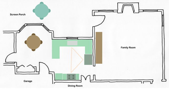
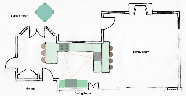
Here are the old and new floor plans noting work triangle, wall to be removed, access to other rooms, etc. Please check back and follow our progress!
Great delivery. Solid arguments. Keep up the amazing effort.
Thanks very much for your encouraging comments.